As part of my research and teaching, I enjoy producing visualizations to effectively convey information to the viewer. This page shows some visualizations from recent works.
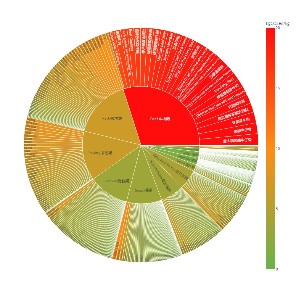
Sunburst plot of dishes with carbon and nutrition labels
If you have difficulty loading the interactive graphic please see a screenshot at the bottom of the page.
About: A sunburst plot showing the carbon footprint (kg CO2eq / kg) and macronutrients of 404 dishes grouped by their dish type. There are 13 dish types: Beef, pork, poultry, seafood, soup, rice & noodles, eggs & beans, sauce, vegetable, congee, sweet soup, dessert and fruit. The colours on the chart reflect the value of the carbon footprint in kgCO2e per kg of a dish. Upon hovering on a dish, nutritional information also becomes available. Clicking on a particular dish type would expand that category to show all the dishes within.
An interactive Food Carbon and Nutrition Dashboard was built with Streamlit in Python which can be used for tracking the nutrition and climate impact of our food choices. It integrates these tools:
- Streamlit for frontend
- Plotly for interactive plots
- Firebase 'Authentcation' for user authentication
- Firebase 'Cloud Firestore' for database
Resources: This interactive plot is powered by Plotly.